

Shedding Some Light on the Drop Shadow
 “Never use drop shadows.”
If this sounds familiar, you’re probably a designer; if it doesn’t, take note. This rule of thumb can be confusing and misleading because there are occasional times that it seems more acceptable than others. But when you understand the reasoning for that very blanket statement, you not only know how and when it’s okay to break the rule, but you can also be more aware and intentional about the rationale behind all your design choices. Below we break down a few “functions” of drop shadows, why not to use them, exceptions to the rule, and how these ideas inherently represent broader principles of visual communication.
1. Function: “Just because it looks cool.”
The most cringeworthy moments in my career have been when I come across a designer who applies photorealistic, computer-automated effect out of pure, irrational impulse.
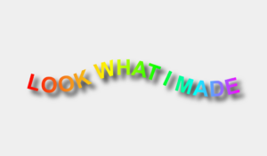
Why Not: In the mid-90s Microsoft launched WordArt, which is arguably the reason the drop shadow gained popularity around this time. “The key to analyzing design trends is to remember that they aren’t inherently good or bad. Instead, they merely serve as a way to observe and remember the collective tastes of bygone eras. (Joshua Johnson, DesignShack)” Using this effect now looks dated because its relevance started and ended when digital word art was new. It made the statement “look what we can do with computers now!” We’re past this — designing typography digitally is commonplace, so there’s no need to show off the automatic attributes that the computer can apply to your text. Sometimes there is good reason for trends at the time of their popularity, but with the passing of time that reasoning also passes, thereby making that trend obsolete.
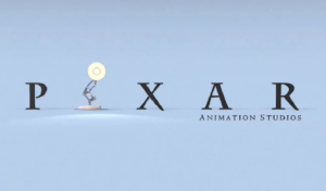
The Exception: When there’s a reason relevant to the content you’re designing. For instance, if there’s something witty about the text being integrated in the scene, saying “yes, I’m text, and yes, I’m here in this photo because it’s clever.” For example, the Pixar logo casting a shadow caused by the lamp, or an umbrella company using a drop shadow as a tongue-in-cheek way to represent their product’s value.

Principle to Apply Broadly: As a basic principle of all design, if you cannot explain why you made a specific choice, you’re discrediting yourself as a designer. Those who frolic through Photoshop sprinkling special effects like they’re birdseed and flower petals are stamping a big, red “novice” label to their foreheads. As always with good design, there must be intention to the choice.
2. Function: A Legibility Crutch
When creating a new design layout, you might choose a busy photo and feel inclined to plop the text right on top of it. Then you run into a legibility problem. Do not take the easy-way-out by adding a drop shadow to the text.
Why Not: The most sophisticated compositions of text combined with image allow the two components to exist symbiotically. They work together; their placement and existence together are so cohesive and seamless that it is as if one could never exist without the other. The text works with the image.
Adding a shadow would allow that text to be plopped on top of virtually any image and it would still be legible. This cheapens it. It implies “we (the brand) could not afford custom photography and a person to plan for the photos to be taken in a way that integrates well with the typography, so we found a cheap stock image, and a cheap way to add a message to it.”
The Exception: Some sources believe that a very subtle, almost undetectable drop shadow is acceptable. I disagree, given the reasons above, which still apply whether or not it’s “detectable” at first glance. That being said, if you must use text over a busy photo, this might be your best solution.
Principle to Apply Broadly: Implications are the main reason for almost anything being considered tasteful or distasteful in design — it’s not just about personal style, it’s about the subtle yet very real statement it’s making.
If you can understand these nuances of what implies, say, a low budget, (even if it doesn’t look cheap to you) it’ll help you to be more objective about applying this best practice in your client’s best interest and helping them to be better off for it.
3. Function: Rendering an Object to Sit in Space
When an object or image needs to truly look like it’s sitting in space in order to communicate effectively, you can either take a well-lit, professional photo with all the necessary resources, or you can create a digital rendering.
Why Not: Theoretically, the most ideal approach is the true photo, for the sake of authenticity and, again, implications. Unfortunately, this is not always realistic, so see below for why this form of drop shadow is more acceptably ubiquitous.
The Exception: A full photoshoot might not be in the cards depending on the circumstances. If you’re posting work samples every day in addition to being responsible for actually creating the work to begin with, or if the project is a tight turnaround, a digital mockup might give you better results than a rushed, less-than-professional looking photo.
Some instances where you might apply this aesthetic:
a. An article was written about your company. You want to announce it on Instagram, and need to come up with a way to display the article as a tangible entity separate from the social post itself.
b. You’ve designed a series of digital ads or assets for one brand. You want to display them as a group, and want to distinguish them as separate parts of a whole family.
c. You’ve designed some business cards but don’t have time to put together a photoshoot, so you create a digital, photo-realistic mockup.


Principle to Apply Broadly: This style for displaying design work may be a passing trend — there may be a more flat way that work is displayed in the future, so keep that in mind. Like with the first example of outdating your text styles, there was trend-inspired relevance to their choice of adding shadow to simple text. Here, there is reason to display work in this way, but it’s not the only way to display work; it’s just the most innovative way we’ve come across lately.
Like they always say, rules are meant to be broken. The more thoughtful and intentional you are with how you break them or follow them, the more you can execute the most difficult visual communication challenges, and even make the most precarious aesthetics make sense!
Share this article
