Have you heard, or rather seen, the news? Sweeney has a new logo! After 35 years in business, the agency has evolved through the eras, inside and out, which is clear to see in our decades-long lineage of logos. The updated visual identity encapsulates Sweeney’s past and looks toward the future with the caliber of quality, customization, and precision found in our everyday work. We invite you to take a look inside the hours of researching, testing, and developing that went into crafting the new visual identity.
Recognizing Opportunity
When we ultimately decided there was an opportunity to upgrade the branding, we identified what areas of the brand were strong, and which had room for improvement. The existing color palette was sensible in concept — warm red supported by a set of neutrals is classic and timeless. However, we saw prospect to shift the “OSU-esque” palette’s gray tints and shades to a more curated selection of warm neutrals. Likewise, the existing Sweeney logo’s concept was nothing we wanted to discard, but rather modernize and refine. The ITC Cheltenham serif was traditional, representing the company’s legacy of experience and honoring its 35-year history. The lowercase typesetting gave it a light modern touch, representing the Sweeney team’s passion, vivacity, and forward-thinking approach to the industry. But the typeface presented challenges for typography on other brand materials. We saw a chance to elevate the craftsmanship of the logo’s form and devise a more flexible typographic system.
Identifying the Goal
The basis of Sweeney’s design philosophy, and in turn, our updated brand, centers around absolute intentionality. All design choices should have a purpose and should communicate optimally using visual principles such as alignment, space, and hierarchy.
“Perfection is achieved, not when there is nothing left to add, but when there is nothing left to remove.” —Antoine de Saint-Exupéry
Type Design — What Is It?
Those outside of the graphic design industry may be unfamiliar with the sub-category of type design, and its complexity. Type design is the process of designing typefaces (commonly known as “fonts”). Designing a functional and visually pleasing typeface requires a multitude of accommodations for the quirks of human perception. Like a drawing of a human face, if the proportions are just slightly out of balance in a drawn letterform, the eye can’t not notice it.
Letterforms come in many different shapes and styles. The three main classifications are serif, sans serif, and cursive. Serif typefaces feature a decorative stroke that finishes off the end of a letter’s stem. This decorative stroke is known as a serif. Sans serif typefaces lack serifs, hence the name. Cursive typefaces imitate handwritten and calligraphic styles. To develop a functional, aesthetic typeface, each letterform must be drawn using a consistent style. A multitude of design variables must be taken into consideration when designing a typeface. These variables include weight, contrast, width, case, and posture. The basic concepts of type design include stroke, counter, body, and structural groups. Strokes are rooted in the gestural movements of handwriting. They create the positive form of a character’s shape. Counters are the negative spaces in, around, and between strokes. These forms help to define the proportion and density of the letterforms. Body is a ratio of height and width that determines the proportion of the characters. Known as structural groups, characters can be grouped by their shared visual qualities.
Calling in Reinforcements
Masterful letterform manipulation was of the utmost importance when developing the new Sweeney logo. Thus, we needed a type-design-extraordinaire — enter Morgan Prenger. Morgan, a graduate of University of Cincinnati’s School of DAAP, and alumnus of Letterform Archive’s prestigious TypeWest program, was the qualified expert we needed. At TypeWest, Morgan studied the history of writing, had access to an incredible collection of typography materials, and inevitably digitized font. “I gained a new appreciation for the nuance of letterforms—don’t get me started on the rabbit hole of optical illusions in the letters themselves!” exclaims Morgan.
The Process
In collaboration with Morgan, our creative team began by analyzing the elements of our previous logo. We identified the strongest aspects and made note of the specific characteristics we wanted to maintain in our new logo design.
Font Research
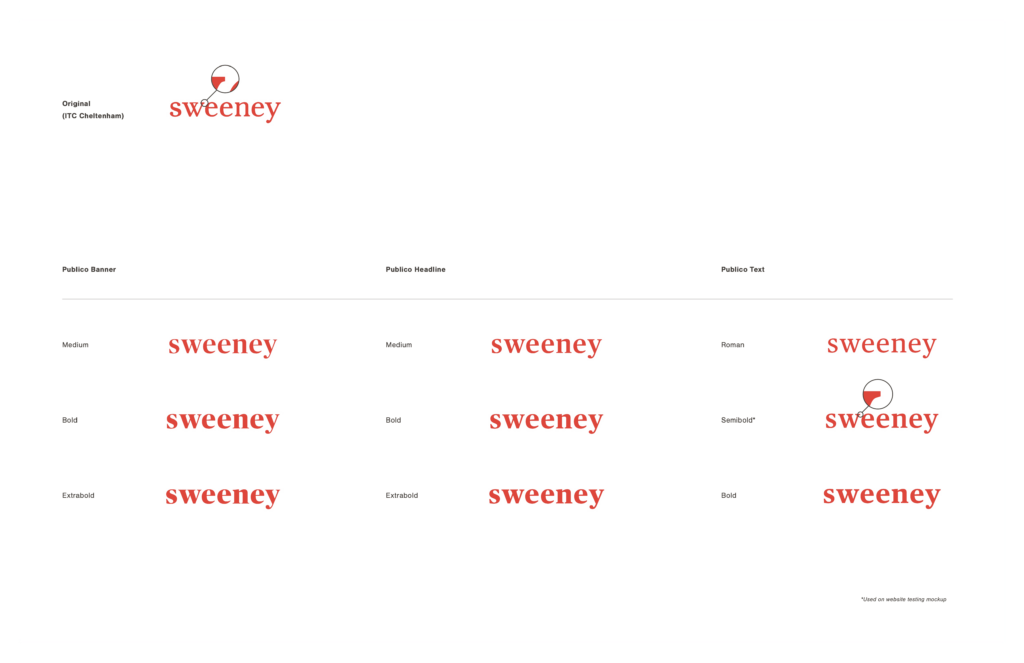
Once those desired characteristics were determined, we began typeface research. We searched for typefaces that maintained the essence of our previous logo and tested their typesetting. Each option was evaluated side-by-side with one another and with our previous logo. Based on these assessments, we narrowed down potential options until we decided upon Publico, from the type foundry Commercial.
“Don’t underestimate the power of a good typeface!” —Morgan Prenger
Publico Weight Exploration
Once Publico was selected, we began comparing the different weights available for our affectionately dubbed “Pub-logo.” Who doesn’t love a good portmanteau? We selected Publico Text Semibold as the foundation for our new wordmark. Slightly weightier than our previous logo, Publico Text Semibold commands a presence in a sophisticated, understated manner.

Publico Letterform Customizations
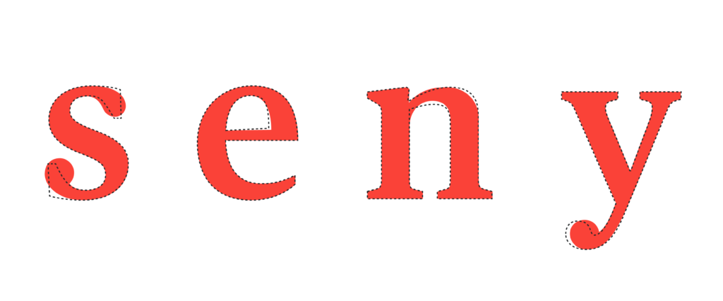
“A wordmark is hardly ever derived from the given typeface alone. Logos deserve extra ‘tailoring,’ and the Sweeney logo was no exception. While the design edits might feel minuscule in the end, this attention to detail is what separates a good logo from a great logo,” states Morgan. The s, e, n, and y were customized to add personality and achieve compositional harmony.

The End Result
We are incredibly proud of the thought, care, and collaboration that went into the final wordmark. The resulting logo is an ode to Sweeney’s substantial history and a manifestation of the company’s core values: precision and intentionality. Says Morgan, “I’m so proud of the collaboration and the final wordmark. The new logo is a solid construction and will serve the company for years to come. It embodies the company itself—’attention to detail!'”


