

What is Microsoft’s Default Font Future?
All good things must come to an end. Calibri, Microsoft’s default font since 2007, will soon be replaced. Microsoft has commissioned five original, custom fonts to eventually replace Calibri as the default and is calling on its social media followers to provide their input on Twitter. Regardless of which font is chosen as the new default, all five options (and Calibri) will be available in the font menu on all Office apps. The fonts that are in the running to become the new default font are Tenorite, Bierstadt, Skeena, Seaford, and Grandview. Let’s take a deeper look at each contender.
What makes a good default font?
Type design is an incredibly complex avenue of graphic design. It is the process of designing typefaces (commonly known as “fonts”). The degree to which tiny differences in typography can evoke completely opposite responses is a testament to the art and science of font design. The design of an individual letter may be artistic but getting the individual letters to make words, sentences, and paragraphs together is a science of its own. Typeface design is a delicate balance of both positive and negative space and shapes. It grows increasingly complex when taking into consideration that default fonts are most notable in the lack of impression they make. A default font is rarely given any thought. Blending into the background of the user experience is its greatest strength. Even though nearly invisible, default fonts still maintain their own discreet personality.
About Calibri
In Office 2007, Calibri replaced Times New Roman as the default typeface in Word and replaced Arial as the default in PowerPoint, Excel, Outlook, and WordPad. Dutch type designer Lucas de Groot developed Calibri from 2002 to 2004. It was released to the public in 2007, alongside the launch of Windows Vista. De Groot described its subtly rounded design as having “a warm and soft character.” Known for its soft corners and narrow proportions. The switch to Calibri in 2007 was driven by the desire for an optimized onscreen display. Microsoft believed that documents would become increasingly consumed in a digital device, rather than be printed, and wanted a modern look to reflect that. Now, in 2022, Microsoft has seen an opportunity to enhance the user experience as the digital world continues to rapidly evolve. Thus, the search for a new font has begun.
Tenorite, by Erin McLaughlin and Wei Huang
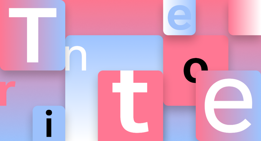
Courtesy of Microsoft
Tenorite is a traditional workhorse sans serif with a friendly style. Wide letterforms lend an open feeling. Large tittles (the dots above lowercase letters like i and j) and punctuation marks allow for easy reading at small sizes on-screen. This counteracts a problem seen with many on-screen renderings of typefaces: the punctuation is too faint, too tightly spaced, or too easily confused with other glyphs. Tenorite Display weights, perfect for headings in Word or PowerPoint, are narrow and heavy. This styling allows for more words or characters to fit on one line, as well as enhances the readability for all-caps typesetting.
Bierstadt, by Steve Matteson
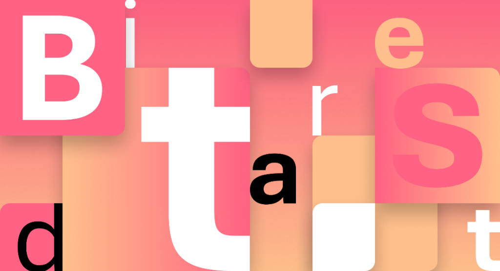
Courtesy of Microsoft
Bierstadt is a contemporary sans serif inspired by mid-20th-century Swiss typography. Highly readable, Bierstadt exudes simplicity and reasonableness. It is categorized as a grotesque sans serif: block-style letters lacking calligraphic elements and contrasting strokes. Helvetica is the most famous example of grotesque sans serifs. Grotesque sans serifs are excellent for grid-based typography. While Bierstadt is systematic in nature, Matteson incorporated organic elements to lend a human element to the digital environment.
Skeena, by John Hudson and Paul Hanslow

Courtesy of Microsoft
Skeena is a humanist sans serif with traditional serif roots. There is a more-noticeable-than-usual contrast between strokes, coupled with generous proportions. Many of the terminals feature a diagonal slice, adding to Skeena’s distinctiveness. Hudson and Hanslow’s goal was to create a typeface that pays homage to 20th-century typography while supplying something unexpected and unfamiliar.
Seaford, by Tobias Frere-Jones, Nina Stössinger, and Fred Shallcrass
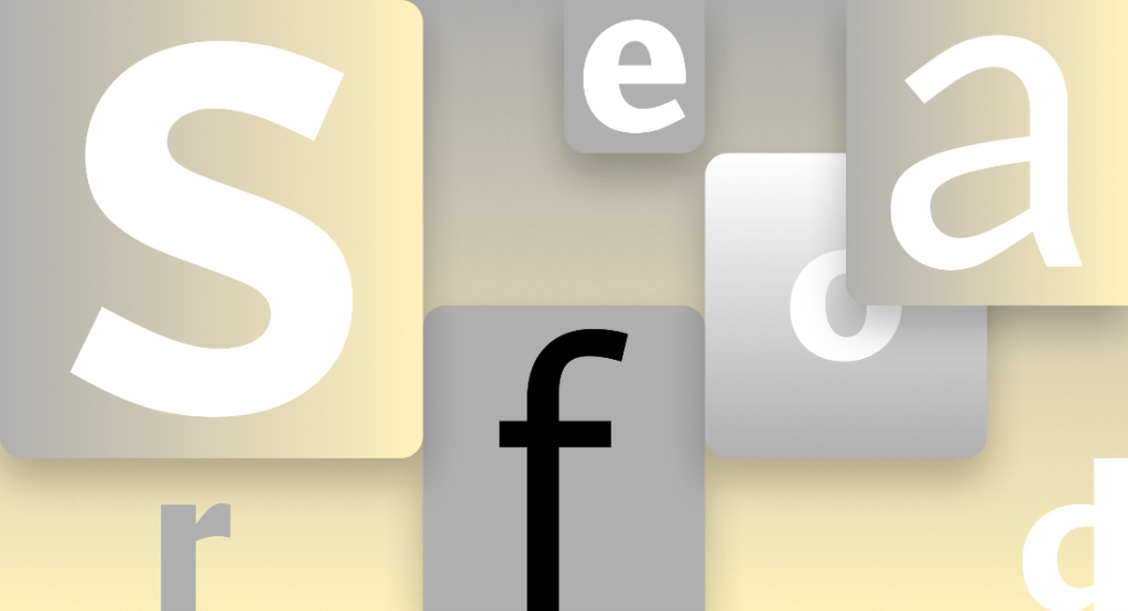
Courtesy of Microsoft
Seaford has roots in old-style serif text typefaces, evoking their comfortable familiarity. The organic and asymmetric letterforms emphasize the differences between letters. This enhances the reading experience by creating more recognizable word shapes. Frere-Jones, Stössinger, and Shallcrass’s goal was to create a warm, inviting, and animated typeface. The overall movement of old-style serifed faces greatly inspired them. Seaford holds the same, familiar warmth of the traditional serif, but is modernized for the digital world.
Grandview, by Aaron Bell
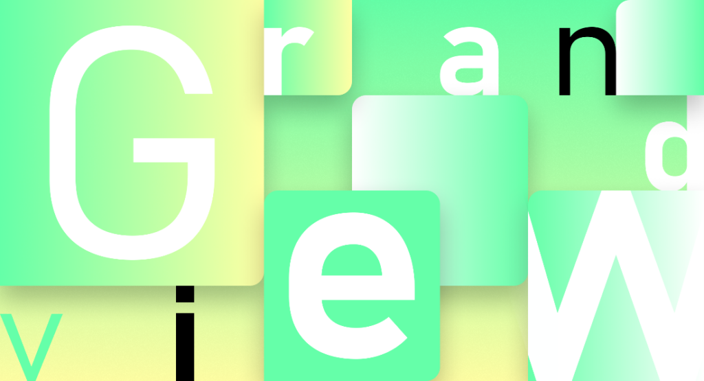
Courtesy of Microsoft
Grandview is a sans serif typeface derived from classic German road and railway signage. This signage was intended to be legible at a distance and under poor conditions and used DIN, originally released in 1931. Though designed for use in body copy, Grandview retains those same qualities of high legibility. This is thanks to a large x-height, which improves readability at small sizes, especially on low-resolution devices. Grandview preserves the mechanical voice of DIN while lending legibility to long-form text.
Which one will it be?
Microsoft will be evaluating these five options over the next few months, but encourage users to chime in. All five families are available for Microsoft users to start testing today. So use the fonts, form your opinions, and tell Microsoft which one you want to see as the new default font!
Share this article
