

Why Packaging Matters
 There’s something about buying a product, seeing the packaging and opening it for the first time. It’s so… satisfying. You can’t beat good packaging. I’m on another one of my Shark Tank binges, and I find that I am easily for or against the product/brand based on the packaging and/or the physical displays that the product is showcased on. But how do we explain the satisfaction of color, shape and feel of packaging? And how is it that sometimes, the simpler the better?
Our senses, duh! Our senses are the gateway to all of our experiences. They’re our connection to the world. They are how we communicate on a day-to-day basis, and as a result, we naturally want to use them any chance we can get. Smell a yummy dessert? Now you want to eat it. See a soft dog? Now you want to touch it. The same goes for a product on the shelf. When we’re drawn to the colors, we want to hold them. It’s in our nature. Our senses are closely connected to our emotions and feelings and that’s how we become attached to a brand – through our memories.
Packaging & Nostalgia
Packaging is nostalgic. As a child, I loved tearing open the wrapping paper on my birthday to unveil the product in all of its packaging glory. And then struggling to unpack the layers of tape and plastic traps to “unlock” my toy. I always had to be the one to tear apart my own packaging, no one else! And I still do. Years ago, you could walk into a store at the mall and see an entire display dedicated to your favorite shoes or clothing line. Now consumers rarely shop at malls! The internet has taken over. In the rare moment that I do see an eye-catching display in a boutique or department store, I can’t help myself but to walk over to it, see the packaging up close, hold/feel it (not recommended during COVID-19) and read all about it. That’s what I did as a kid.
Now, I’m guilty for ordering too many packages for my Amazon Hub to handle. Everything I order comes in a brown box. Or if its clothing, a multicolored plastic padded envelope with a slip of paper inside with the message “Thanks for purchasing your sage-patterned midi dress!”. As consumers in a digital (and now socially distanced) world, the internet is our shopping resource, and in turn, we’re losing the palpable experience of a brand. Tracking a package isn’t experiencing a brand. We’re forgetting what experiencing a brand feels like (literally!). Brand personality is growing online and not in our hands. And for the few brands that put an extra something special into their packaging, this is for them!
Shipping Packaging
We as consumers are so used to that plain brown box… It’s easy to forget that brands have personality outside of their social media pages, website and annoying email marketing campaigns. Here’s a thought: Shouldn’t we give more time to a deliverable that we know will be opened 100% of the time, like a package, rather than an email that might only be opened by 25% of your contact list? I know of a few brands that have clearly thought the same way…
Nordstrom
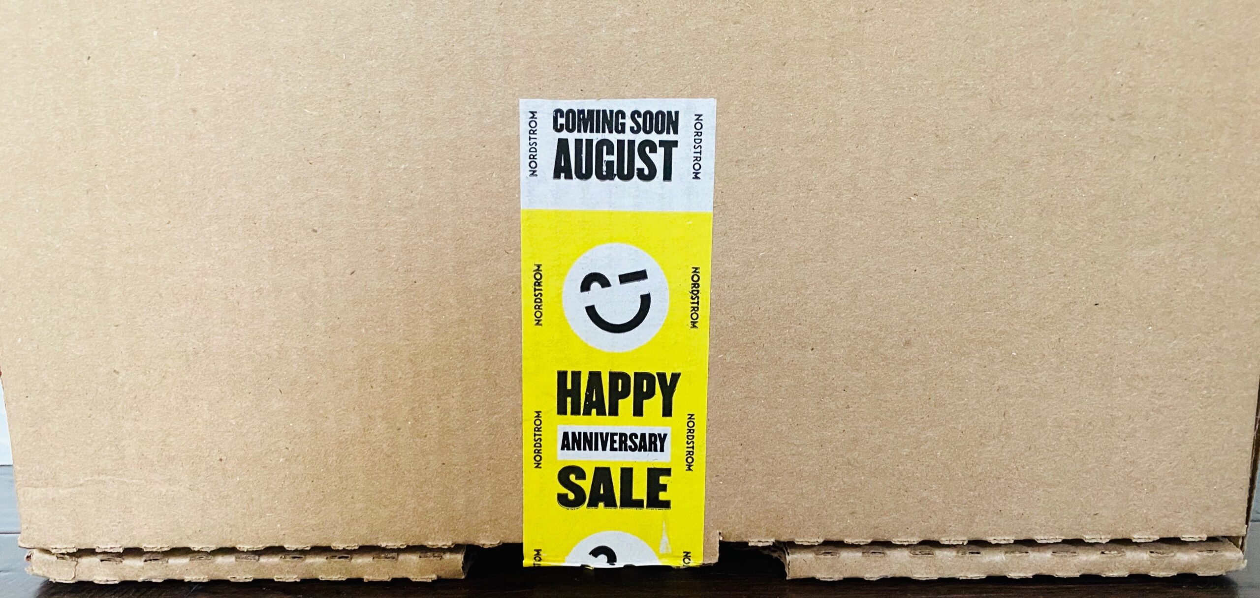 Okay okay… still a plain brown box. But check out the tape! Looks like Nordstrom knows how to think outside of the box and added a little pizazz to the one accessory that goes on most all shipping packages. In this case, it was used to advertise an upcoming anniversary sale, but imagine using something as simple as a strip of tape to add personality to your brand. Talk about getting the most of all of your resources!
Rothy’s
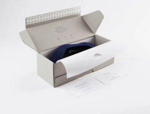
Photo courtesy of Rothy’s.com
Now we have shifted from the brown box to a white box. But it’s not just any white box, it’s the shoebox itself! We’ve already explained how Rothy’s is doing it right in last week’s blog, but they really upped the ante with their sustainable solution of using the least amount of packaging as possible without any tape! Therefore, their packaging and card stock inside is 100% recyclable all while being made from 85% post-consumer recycled materials.
FabFitFun
I had to mention subscription services because of course they’re ahead of the game! Just look at those colors! And how do they get all of those products into one box and still make it look good?!
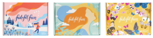
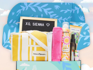
Photos courtesy of fabfitfun.com
Hello Fresh
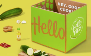
Photo courtesy of hellofresh.com
Had to take it up just one more notch with a meal-kit subscription service. They know how to keep their product fresh on the long road to their happy customer! Oh, and the package is 100% recyclable, even the gel packs!
.
.
The Packaging Pros
Remember how I mentioned the whole “simpler the better” idea? I’ve got one brand for you. Apple. Need I say more? Clean, sleek and dense. I personally reuse their containers as drawer/desk organizers because of their durability. Some have called it a “sensory experience.” And just when you thought that simple white box couldn’t get any more satisfying, it’s fiber-based materials are part of a larger commitment to reduce Apple’s environmental impact. But don’t even try to re-pack Apple products… It’s nearly impossible!
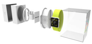
Photo courtesy of blog
Personal Favorites
Excuse me while I geek out about some of my favorite packaging…
Maileg
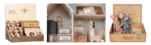
Photos courtesy of maileg.com
I’m a sucker for these hand-stitched mice! Packaging includes mock cigar boxes, miniature tin suitcases, match boxes and other vintage-appealing patterned containers.
Method
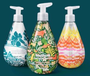
Photo courtesy of methodhome.com
Method took over Target stores with their “plain” design for cleaning products but ironically enough, it works! By carefully choosing color, a simple typeface and a sleek bottle design, Method’s containers stand out in the soap aisle. They also feature limited edition soaps that stand for different causes like the one below called the Woman in Design Collection. This celebrates female “designers who used creativity as a force for progress.”
.
.
Poppi
How is it that I can look at a can without ever have hearing of the product and want to drink it? Poppi does the trick with its vibrant colors, pop of contrast and simple fruit-related icons.
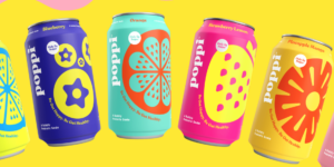
Photo courtesy of drinkpoppi.com
Fossil
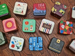
Photo courtesy of dribbble.com
Fossil Watch tins are the perfect durable, reusable containers. And they have loads of personality. I use mine for bookshelf décor!
.
.
.
.
Lush
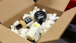
Photo courtesy of lush.ca
It’s as simple as black and white. It doesn’t matter what’s on the outside, it’s the inside that counts! Being one of the most sustainable brands I know of, their packaging is 100% post-user. Read all about it in detail here.
.
.
.
Wow, I just said “packaging” a lot, but I guess that’s because this is a blog about, you guessed it… packaging. If you have questions about packaging design, please feel free to reach out so I can geek out some more!
Share this article
