

You Can’t Unsee This Design Trend
 Several months ago I was driving East on Carnegie Avenue, taking in the view — that is, the spectacle of billboards so densely packed within a mile stretch you barely notice the road itself. As a designer, I’m a unique audience for these kinds of advertisements because most of my attention is spent observing the visual and verbal technicalities of the design rather than buying into whatever’s being sold. So naturally, I noticed immediately when I passed two billboards within the same block, for two different brands, that shared almost the exact same design. A ray of color ascended from the bottom-left corner leading into a headline. Sure, this coincidence was funny enough, but in the months that followed, I’ve come across so many examples of this design trend that I truly cannot unsee it. Is it just me, or is the diagonal text trail everywhere these days?
I went back recently to find that the billboards have since been taken down, but below I’ve documented the other moments I’ve come across this design trend since I first recognized it.
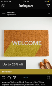
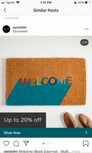
1. West Elm Doormat Instagram Ads
2. P&G’s Pride Month Campaign

3. RTA Ad on a Neighborhood Bus Stop
4. AT&T Snapchat Ad


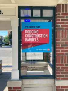
And finally, to further prove the haunting nature of this design trend, here’s an example our Integrated Marketing Specialist, Jennifer Mabes, came across just a few hours after I pitched this blog topic to her:

Apparently, this “long shadow” technique first gained popularity in 2013, but lately it seems so viral it could become the next TikTok dance. Is this just an extreme case of the Baader-Meinhof frequency illusion, or is the diagonal text trail truly following me everywhere I go? Will the awareness become contagious for our blog readers, as was the fate of poor Jennifer? It’s clear this case is anything but closed, so I hope you’ll all join me in embracing this as a bizarre but delightful scavenger hunt!
Share this article
