

Constructivism’s Design Legacy
Following World War I and the overthrow of Czar Nicholas II, Russia engaged in a civil war. The Red Army of the Bolsheviks emerged victorious in 1920, leading to the Bolshevik Revolution where art and design flourished. Experimental typography, straightforward pictorial designs, and political messages and ideology defined these designs. The Revolution fueled Russian artistic design. Constructivists sought to reimagine the traditional academy artist as an engineer. They were also on a mission to create an art form relevant to a rapidly industrializing world. Russian Constructivism has had a lasting legacy. We’ve collected examples exploring Constructivist-inspired design, from its conception to the present day.
What Is Constructivism? Why Is It Still Seen Today?
Constructivists considered all art and design a political tool. The visual style featured geometric shapes, dynamism, bold typography, and photography. Constructivism died with Lenin in 1924. However, its legacy lived on through the Bauhaus school in Germany, Latin America, and the International Typographic Style in Switzerland. The Constructivists’ systematic methodology still informs professional design practices today and the visual characteristics remain instantly recognizable.
Constructivism’s Conception

Beat the Whites with the Red Wedge, El Lissitzky 1919
El Lissitzky designed Beat the Whites with the Red Wedge in 1919. The composition is riddled with symbolism. Its message is very straightforward and easy to comprehend. The red triangle, harsh and angular to represent the revolutionaries, pierces the soft circle that represents the anti-Communist White Army. The Red Army pierces from above, creating an aggressive quality and a feeling of encroaching of space.

Dobrolet, Aleksander Rodchenko, 1923
Alexander Rodchenko created Dobrolet, a lithograph print, in 1923. Rodchenko was one of the founders of Constructivism. Dobrolet is a poster promoting a Russian state airline. Rodchenko utilized a limited color palette and bold forms such as the oversized exclamation point. It conveys a sense of boldness, with the red popping sharply against the simplicity of black and white. The diagonal upward direction of the plane suggests dynamism and movement.
Constructivism In the 1980s
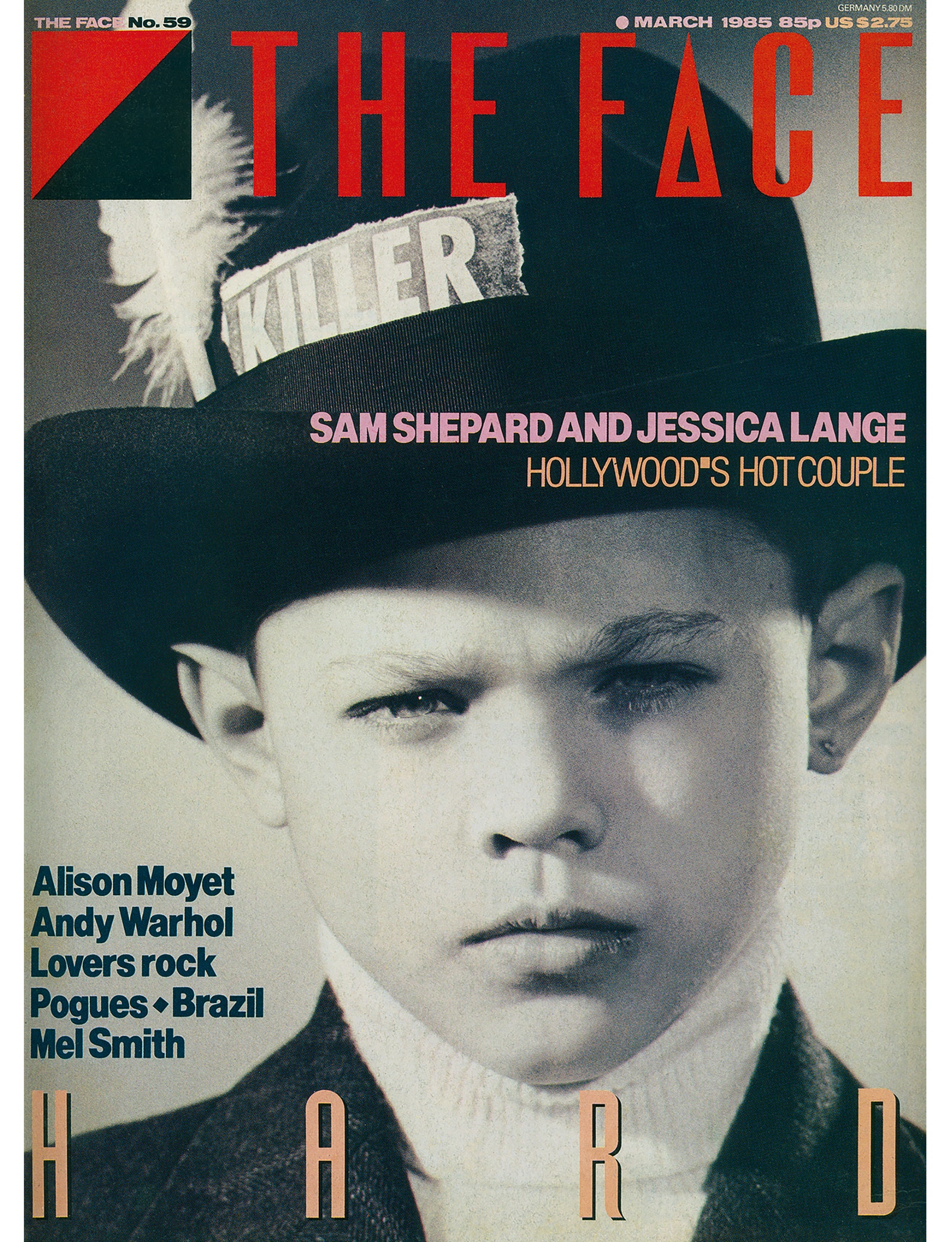
The Face, March 1985, by Neville Brody
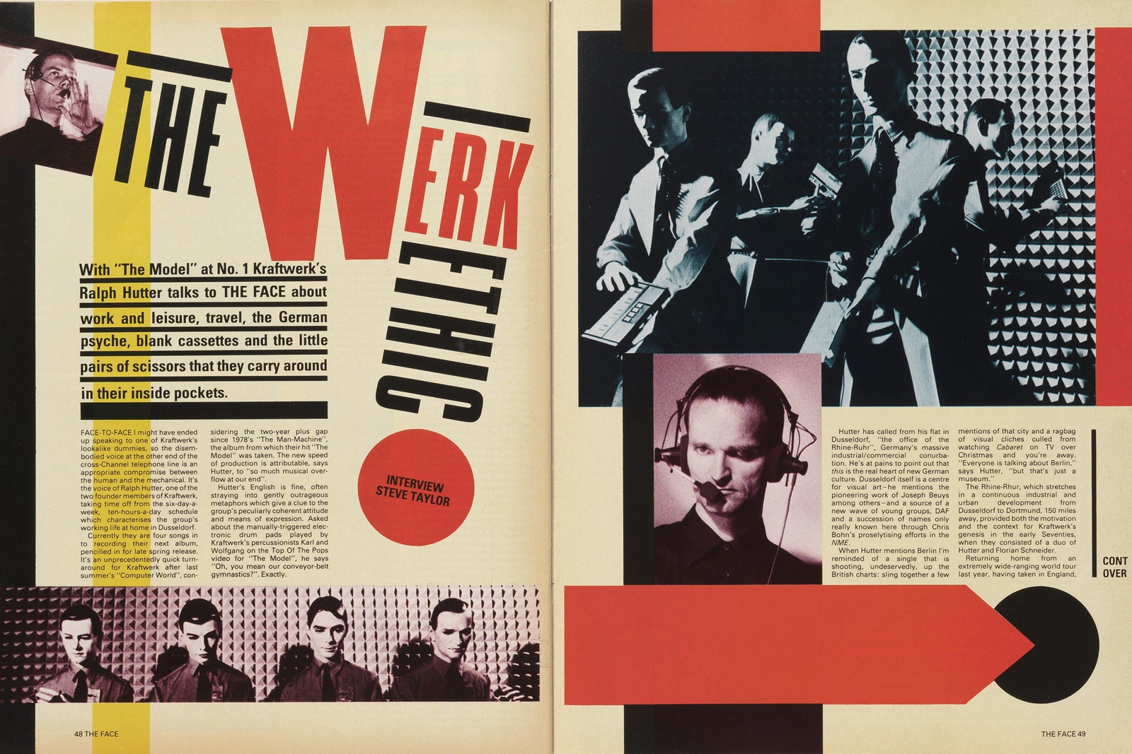
Kraftwerk, March 1982, by Neville Brody
The Face was a British music, fashion, and culture magazine that was considered a style bible. It was originally published from 1980 to 2004 with Neville Brody as art director until 1986. The cover’s masthead incorporates sans-serif typography, contrasting black and red, and geometric triangles that form a square, and an isosceles triangle that replaces the “A” in “Face.” The cover design limits typography rather than overcrowding the page. This reflects the sparse typography included in Constructivist designs, as much of Russia’s population was illiterate. British model Felix Howard’s eyes pierce the viewer in a black and white image. The picture is a nod to Constructivist experimentation with film photography.
Brody creates a strong sense of dynamism in the Kraftwerk article’s opening spread. He orients the headline diagonally, but with a large-scale “W” placed perpendicularly on the page. He incorporates thick rules and rectangles, large circles, and other various geometric shapes. The bold forms, color palette, and dynamic typography all reference Constructivism directly.
The Face was a living laboratory where I could experiment and have it published. Our golden rule was to question everything. If a page element existed just as taste or style, it could be abandoned. Page numbers could be letters or shapes increasing in size. We could start the headline on the page before. We had disasters and near misses every issue…It certainly wasn’t a nine-to-five job. You had to be obsessed to make it work.
— Neville Brody
Constructivism in the 2000s
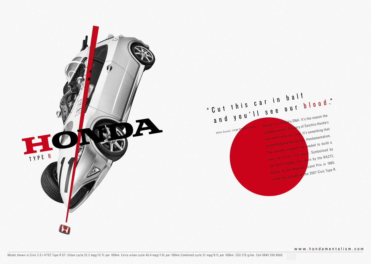
Honda Type R Advertisement, 2007, by Richard Hooker
Richard Hooker designed Honda’s 2007 ad campaign for their Civic Type R. Hooker reduces his color palette to black, white, and red, incorporates bold text, and superimposed images. The main image is a photomontage of a race car and the Civic Type R, pierced by a slender red triangle. As Constructivists championed art as practical functionality, it is fitting to use their design elements to advertise a car. A car’s purpose is to transport a person from one point to another; it is functional design. Incorporation of Constructivist elements conveys the reliability, practicality, functionality, and innovation of the car. The car is a design with a purpose – the embodiment of Constructivism.
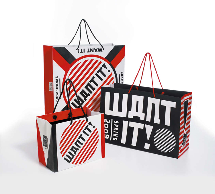
Shopping Bags, 2009, by Studio Number One
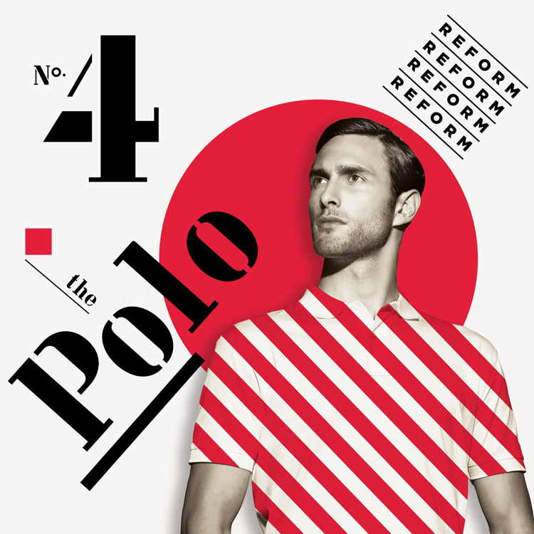
Polo Advertisement, 2009, by Studio Number One
Saks commissioned Studio Number One, owned by Shepard Fairey (of Obama’s “Hope” poster fame) for a 2009 ad campaign. Fairey drew heavily from Constructivist design principles, as well as posters made for the Works Progress Administration in the 1940s. This campaign is quite tongue-in-cheek, using communist art motifs to promote consumerism. The stylized text on the shopping bags resembles Russian language and Constructivist typography. The entire campaign utilizes a limited color palette of black, white, and red; bold and dynamic typography; thick rules; and circular motifs.
Is Constructivism Here to Stay?
The answer is yes. Although Constructivism was short-lived, the ideas and the style of the non-objective works continued to inspire artists and designers in other countries. A number of Constructivists became lecturers at the Bauhaus in Germany in the 1920s. Constructivist design principles can be seen everywhere, from the De Stijl style to major graphic and advertising artists today. Constructivism’s straightforward visual communication, objective methodology, and spotlight on advances in industry and technology ensure a lasting influence. It will continue to inspire artists and designers for years to come.
Share this article
