

3 Design Trends to Leave in 2020
Illustration by Katharina Brenner [Source: AIGA Eye on Design]
Needless to say, there’s a lot we’d all like to leave behind as we head into the new year. While most are much heavier and more significant than my personal design trend observations, I consider the happenings of the creative industry a welcome distraction. As hopes rise for what lies ahead, so may our appetite for new creative innovations. 2020 brought a lot of new visual motifs, and although they were fun to see arrive, it may also be best to watch them go. Below I’ve gathered three design trends to leave in 2020 where they belong, accompanied by what’s next for their evolutions.
1. Varying-Width Type
Don’t get me wrong. The freedom and creativity applied to typeface design last year was a refreshing and impressive departure from our old habits. This particular type trend is nothing short of inventive, engaging and imaginative. My criticism is that the design industry saw it used once and clung on for dear life. Let’s not forget the importance of intentionality and meaning in our design choices. These typefaces shouldn’t be abandoned completely, but we had our fun using them for the sake of novelty last year. Keep this option in mind if it’s relevant to your message or brand, but otherwise, move on.
What’s next: Continue designing and discovering original, exciting typefaces, and pushing the boundaries of the world of typography, but be sure to use them with purpose.
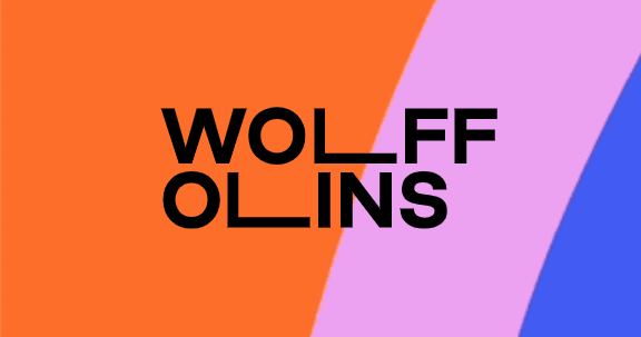
Wolff Olins Logo [Source: wolffolins.com]
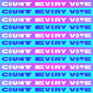
Campaign Graphic [Source: @VoteJoe]
2. The Blobby Character Illustration
This trend has been so important for the field of visual communication because it has normalized body inclusivity in everyday branding. And while that progress must continue, I believe there are many, many ways out there to do it that aren’t so derivative. Not only are consumers going to get sick of seeing the same aesthetic applied to every figure drawing, but it’s going to hurt brands. AIGA Eye on Design demonstrated it best in their article, “Don’t Worry, These Gangly-armed Cartoons Are Here to Protect You From Big Tech” — brand recognition is drowning in the sea of ubiquity.
What’s next: If you’re a designer, throw your client a life raft with a new take on inclusive figure design. Find your own way of doing it, and set the next trend (but be prepared for the greater visual communication industry to inevitably overuse and abuse it just like this one).
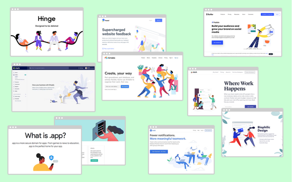
Compilation of Brands Using Blobby People [Source: AIGA Eye on Design]
3. The Diagonal Text Trail
Apparently, this “long shadow” technique first gained popularity in 2013, but lately it seems so viral it could become the next TikTok dance. In September, we published a detailed exploration of this trend, and I’ve continued to be bombarded with it since. It has become tiring to look at. Move on people. Let it go.
What’s next: Anything… anything but this. I predict the next thing flooding our feeds and TV ads will be outlined type… take note next time you see a commercial on Peacock.

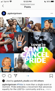
AT&T Snapchat Ad [Credit: AT&T] Procter & Gamble Pride Campaign [Source: Procter & Gamble Design]
Share this article
