 Next to Super Bowl television ads, very little gets the industry more excited than the announcement of a new corporate logo.
Pop Quiz: What do logos and opinions have in common? Answer: Everybody’s got one!
Personally I think way too much time, effort and money is put into creating logos. They are, after all, just a brand mark designed to represent the entirety of the organization.
No company ever succeeded or failed because of its logo. Still, like everyone else, I am curious about new ideas and developments. And with the unveiling of the “new” Microsoft logo, I realized a new trend in logo design: squares (like nerds) are suddenly very popular.
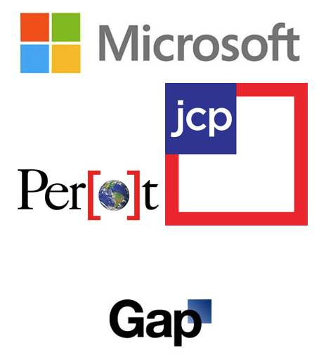
Consider just a handful of the major global brands (The Gap, Perot Museum of Nature and Science, JCPenney and Microsoft) that have launched new logos in the past year or so. Lots of blues and reds, lots of squares (and squares inside of squares) and a couple of colossal flops.
As you likely heard, the Gap logo was so disliked by loyal customers (or so we are told), the new logo disappeared almost as quickly as it appeared. As for JCPenney, the fair and square initiative has failed so miserably that customers and investors have forced management to alter its plans and eliminate all sales from future marketing, which may actually turn out to be good news and good business.
So what’s the big deal with the squares? I mean, I get why a company like Square would have a square within a square logo (even if it is a direct ripoff of the Target logo), but why are so many heavy hitters headed in that direction. Maybe, these four-sided structures reference the four cardinal directions (north, south, east, west)… or perhaps the four major seasons (winter, spring, summer, autumn)… or the four cosmic elements (suns, moons, planets, stars)… or the four common phases of human life (birth, child, adult, death)… or perhaps the four prime elements (fire, earth, air, water).
Or maybe the designers just like squares.

