

New IHOP Logo Inspires Change… for Everyone.
Have you seen the new IHOP logo?
It is being lauded as a clever transition from a traditional and tired, frown-faced logo to a modern, social media friendly, emoticon-ready logo. And after all, isn’t that what every logo is supposed to be? I am pretty sure that’s what People PC had in mind when they created this logo (any similarity between the IHOP and PeoplePC logo are strictly coincidental):
![]()
Anyway, that got me thinking… why can’t I create some better logos for companies that need them; whether they know it or not. So I did, because I could.
I call this one the Smoogle logo. It is a subtle, yet happy emoji logo:

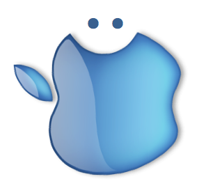
And this one I refer to as the Smapple. I think it is the kind of design Steve Jobs would be proud to unveil:
Of course, the traditional print media has no desire to be left behind in this ever-changing digital world; I call this the SmUSA Today. Some see a blue nose, while others just see the smiley face.

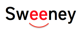
And, finally, there is the new, upbeat Smeeney logo. It takes a simple, straightforward type treatment and really pushes the edge of the envelope:
Who says marketing and and corporate identity and branding is difficult? Anyone with a crayon and a cranium can do this stuff. Just ask the guys who created the new IHOP logo.
Share this article

Written by : Jim Sweeney
Jim is a veteran of the agency industry and the founder of Sweeney. He is uncommonly passionate about the idea of creating and implementing insanely great marketing campaigns that achieve insanely great results. He pioneered the full-service, full-circle agency model and continues to forge new ideas in an ever-changing industry. And he is accessible to everyone about anything, seemingly all the time, serving as a mentor to all agency personnel and clients.