Sweeney recently embarked on a brand refresh, though as Creative Director Keith Humphrey points out, it’s more accurate to call it a brand evolution. We sat down with Keith to discuss the thinking behind the refresh, what changed and what it means for the agency’s creative future.
Q: From a creative perspective, what prompted the decision to evolve the brand in the first place?
Keith: When I joined Sweeney, I looked at our materials, especially the website. They didn’t really scream “creative agency.” It leaned more toward a hard, business-driven identity. That perception mattered. The refresh was about evolving the brand to better reflect the creativity happening inside the agency.
Q: So, what actually changed?
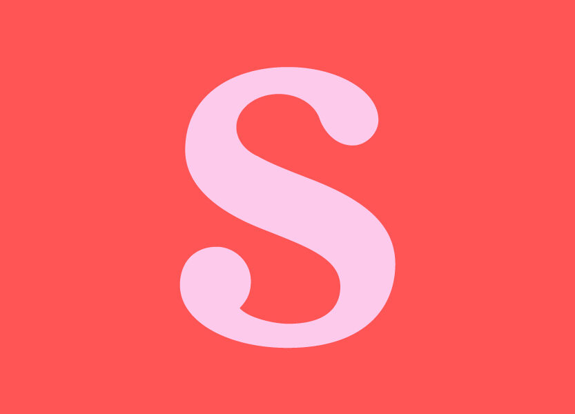
Keith: On the surface, not much—and that’s intentional. We didn’t throw away the existing logo or brand equity. Instead, we softened the red in our palette ever so slightly. Unless I blew it up on screen and pointed it out, most people wouldn’t even notice.
The real evolution is in how we use the palette, the typefaces we employ, and the way we’re applying design across materials. You’ll see the biggest transformation on our website (coming soon!). It will feel dramatically different—simpler, more intuitive and more reflective of our creative side.
Q: Why simplicity for the website?
Keith: In print, you want variety and surprise to keep people turning pages. Online, that same complexity is frustrating. Nobody wants to dig through dropdown menus on their phone. The best web experience is one that’s simple, scrollable and intuitive.
The redesign will streamline the user experience while highlighting our creative capabilities more effectively.
Q: Was there research behind the evolution?
Keith: Absolutely. But research for me isn’t a one-time exercise – it’s constant. I’m always looking at what other creative shops are doing: their websites, Instagram feeds, even their books.
It’s not about copying trends. It’s about understanding tone, voice and approach. How do they talk about themselves? Are they too serious? Too self-important? I look at it from a client’s perspective: does their brand feel approachable, inspiring, and trustworthy? That thinking informed the direction we took.
Q: What about the colors and typography? Any symbolism there?
Keith: Color was a big discussion point. We initially explored bold fuchsias and purples—colors I love and see a lot of creative firms using right now. But going too far from our classic red risked losing brand equity.
Ultimately, we landed on a more subtle evolution: softening the red, expanding into complementary tones, and pairing them with typefaces that feel fresh without being trendy. It’s a balance between staying relevant and respecting the identity people already recognize.
Q: What’s next for Sweeney’s brand?
Keith: The website evolution is the biggest step, but this is about more than design. It’s about shaping perception. We want businesses to see Sweeney as the creative partner they can trust with big, ambitious ideas.
This isn’t just a visual refresh. It’s about staking our claim as a creative agency with serious capabilities.